Different operating layouts for the keyboards were developed. This page shows the seventeen most commonly used keyboard diagrams shown in the book of Linotype, as mentioned in the 1966 matrices collection book by the Mergenthaler Linotype Company (on page 104). The selection of the diagram depended on the desired face and the used type of magazine. Some could be applied to all machines by replacing the keys and the typeface in the magazine, others were only applicable on specific machines, such as the ones with an auxiliary magazine on the right side of the machine which often had a second keyboard.
Taking into account the space limitations within the magazines, as described here, the Mergenthaler Linotype Corporation puts a warning next to this chapter in their book: 'Departure from standard layouts should be avoided where possible becasue of channel-size limitations and the possibility of error in ordering specially-cut characters.' Indeed, it is possible to exceed the maximal thickness of a matrix in the channel, but then the channels on the left and/or right side will be obstructed. The matrices designed to go with the above diagrams were specifically designed to leave some channels in the magazine open, not blocking eacch other's passage.
Note that I add the space key to the drawing so allow for a better overal image.
The description by the Mergenthaler Linotype Company is: (diagram nr. 12) The standard 90-character keyboard with fractions running pi.Permits the keyboardding of one font consisting of lower case, caps, small caps, figures, points, space material, and ligatures.
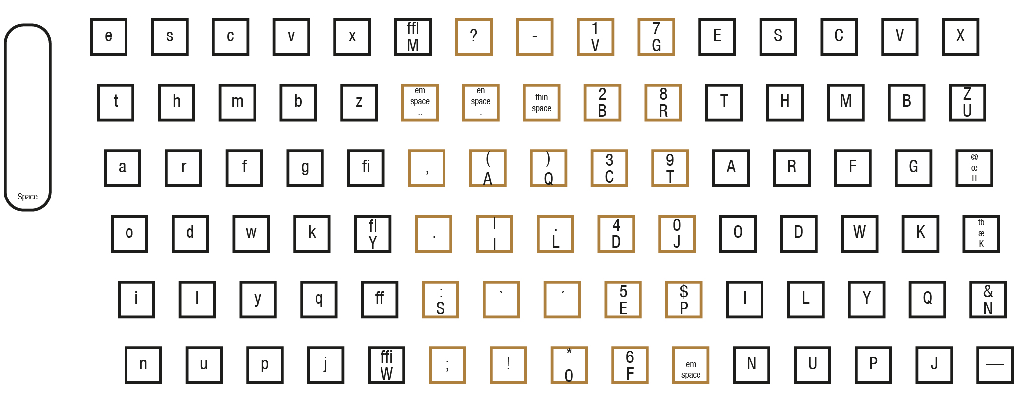
The description by the Mergenthaler Linotype Company is: (diagram nr. 11) The standard 90-character keyboard with fractions keyboard. This is a variation of Diagram 12, with fractions substituting seven other characters in the magazine.

The description by the Mergenthaler Linotype Company is: (diagram nr. 32) Advertising figure layout for 90-channel magazines. Advertising figures are cut to run in place of some other characters in the magazine, which can be run pi. On regular 90-channel magazines this diagram will accomodate a maximum figure width of 0.166", and on Wide 90-channel magazines a maximum figure width of 0.1937".
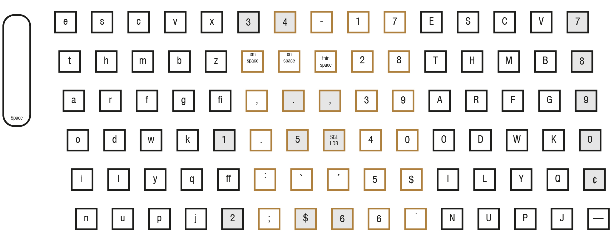
The description by the Mergenthaler Linotype Company is: (diagram nr. 135) Layout for two lower case fonts with spaces and points in 90-channel magazines. Caps and figures of each lower case font usually will run in two auxiliary magazines according to Diagram 52 or 177.
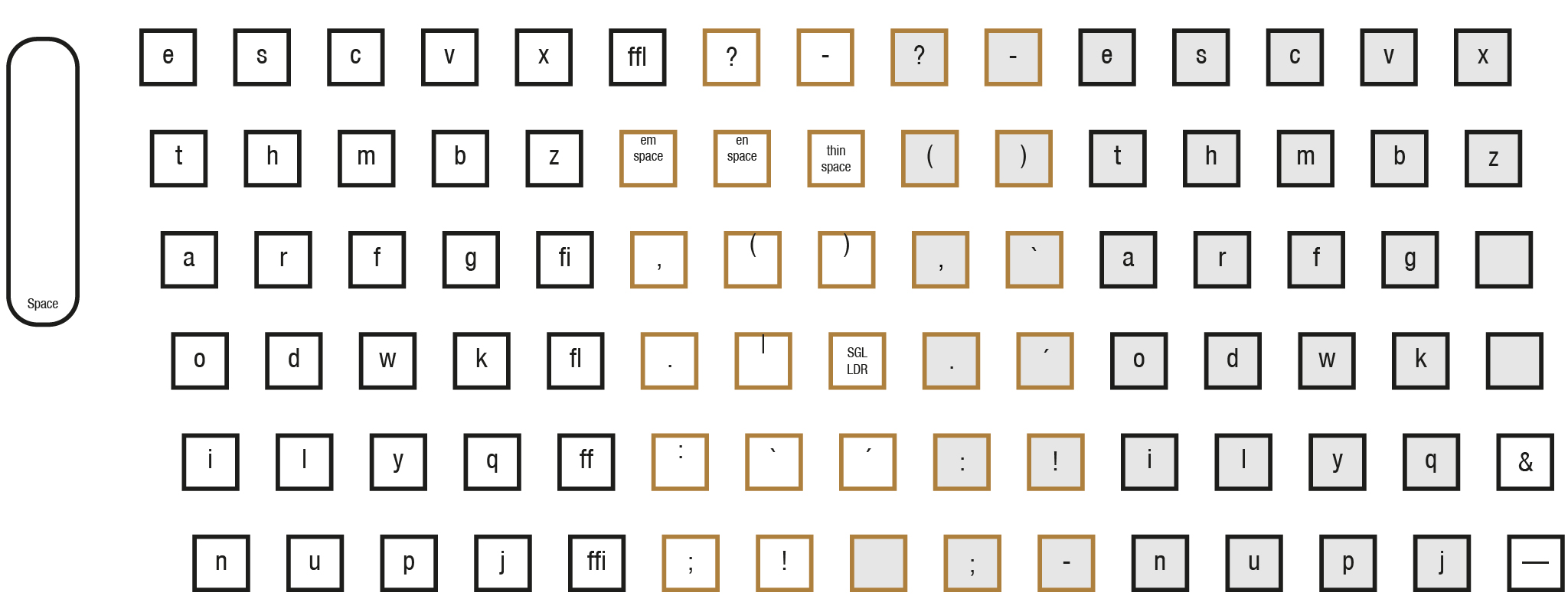
The description by the Mergenthaler Linotype Company is: (diagram nr. 138) Layout for two lining faces, each with figures and points, to run in a 90-channel magazine. Both faces arranged for easy keyboarding.
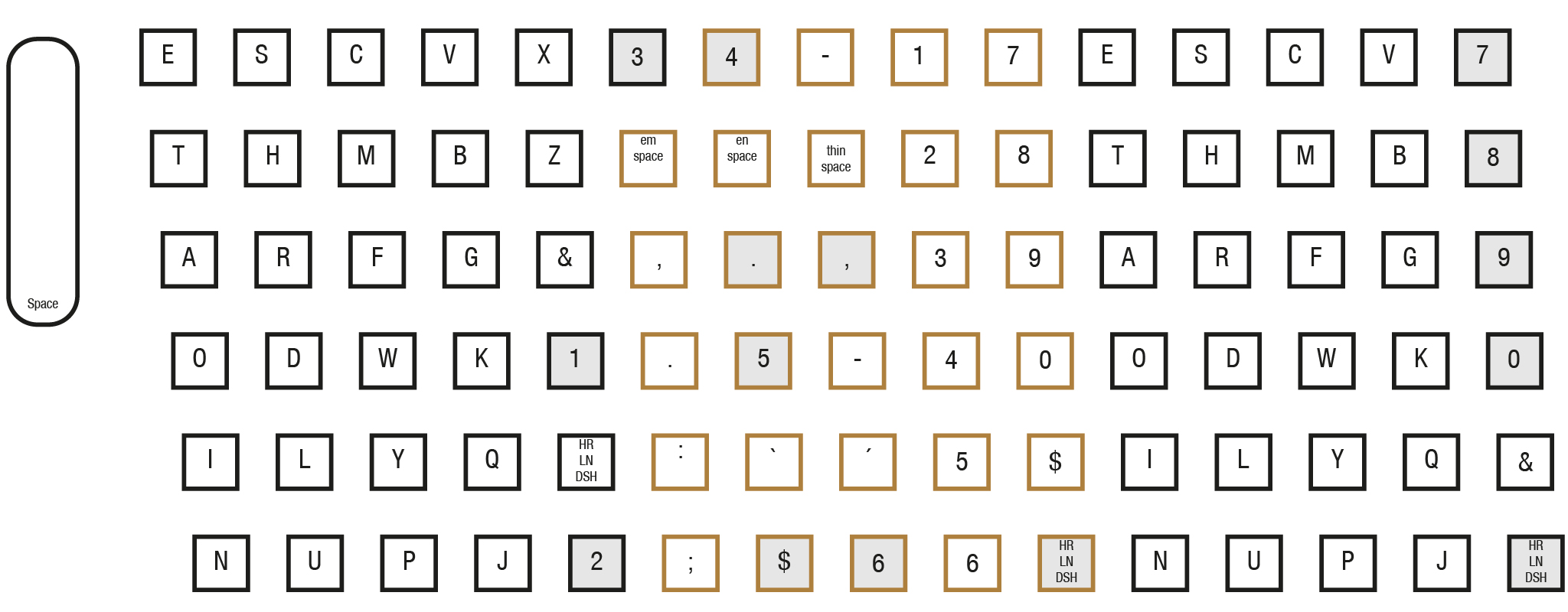
The description by the Mergenthaler Linotype Company is: (diagram nr. 282) Standard layout supplied for Teletypesetter operation where fractions are not required.
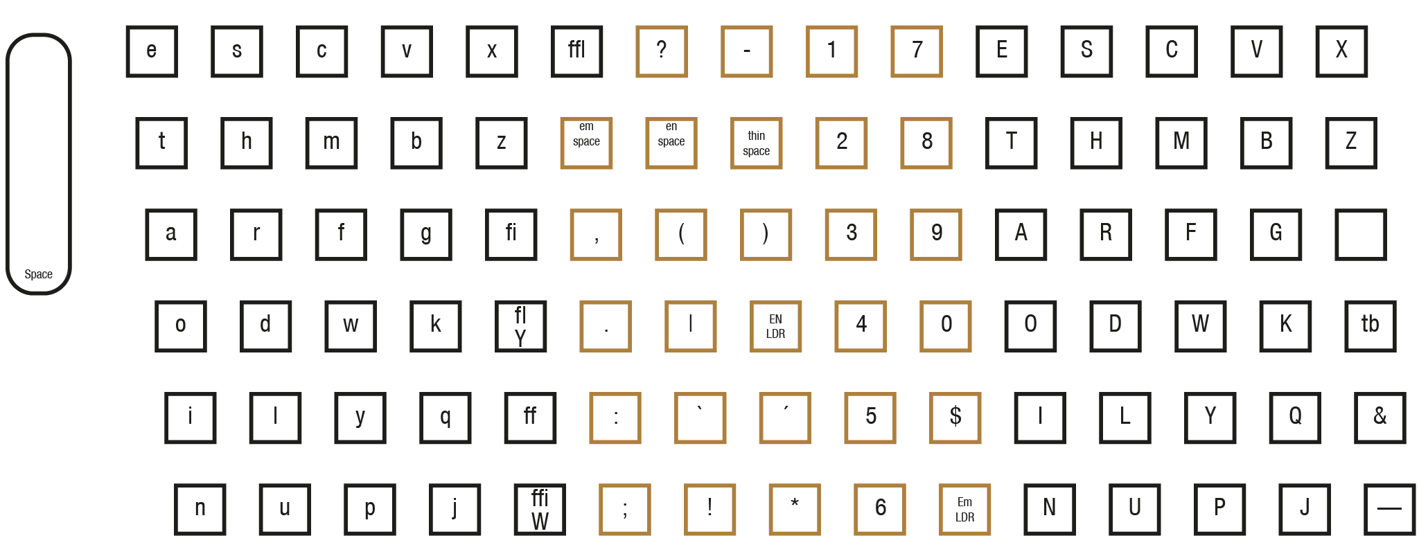
The description by the Mergenthaler Linotype Company is: (diagram nr. 282-f) Layout for Teletypesetter operation where fractions are required. Special channel of em spaces cut to run in vertical rule channel (40).
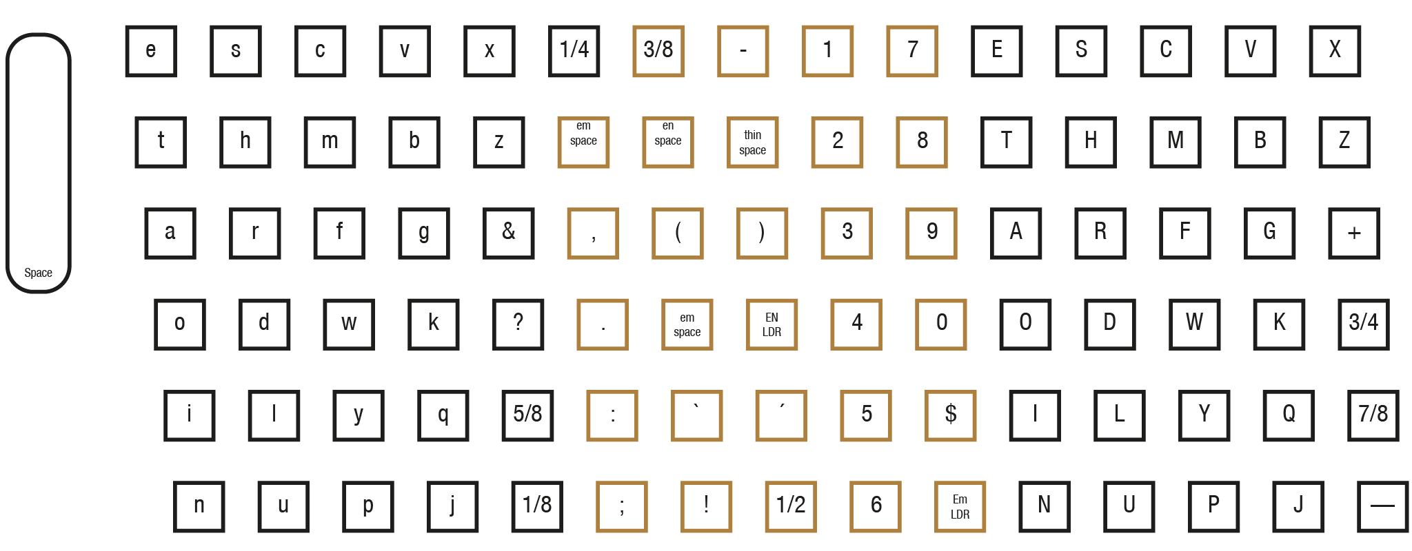
The description by the Mergenthaler Linotype Company is: (diagram nr. 98) Layout for three lining faces in 90-channel magazine, all figures running pi. The face in center channels is arranged according to small cap layout.
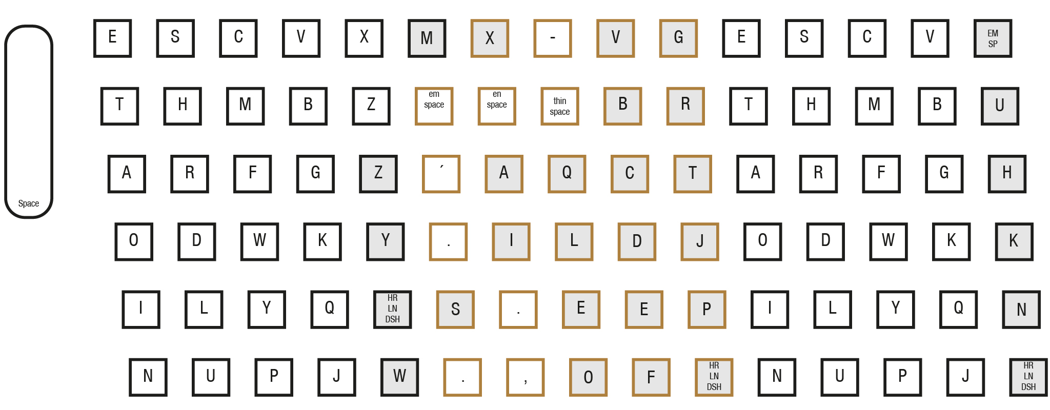
The description by the Mergenthaler Linotype Company is: (diagram nr. 150) The standard combination keyboard which consists of Diagrams 12 and 103-c, arranged on one 90-character keyboard. Shaded keybuttons are inoperative when assembling from 72-channel magazine. This layout is most versatile as used on the 72-90 Mixer models.
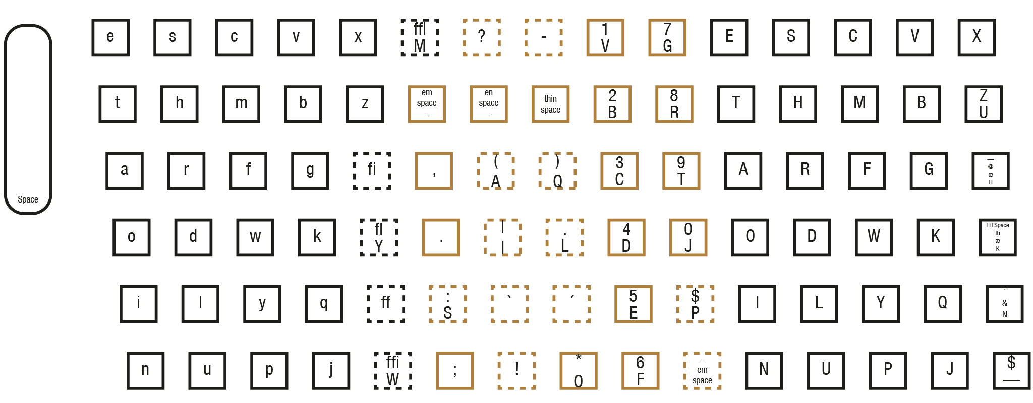
The description by the Mergenthaler Linotype Company is: (diagram nr. 103-c) Layout for 72-channel magazine on 90-character keyboard. Provides for keyboarding of lower case, caps, figures, spaces, and points; each arranged according to standard sequence except for points. Shaded keybuttons are inoperative when assembling from 72-channel magazine.
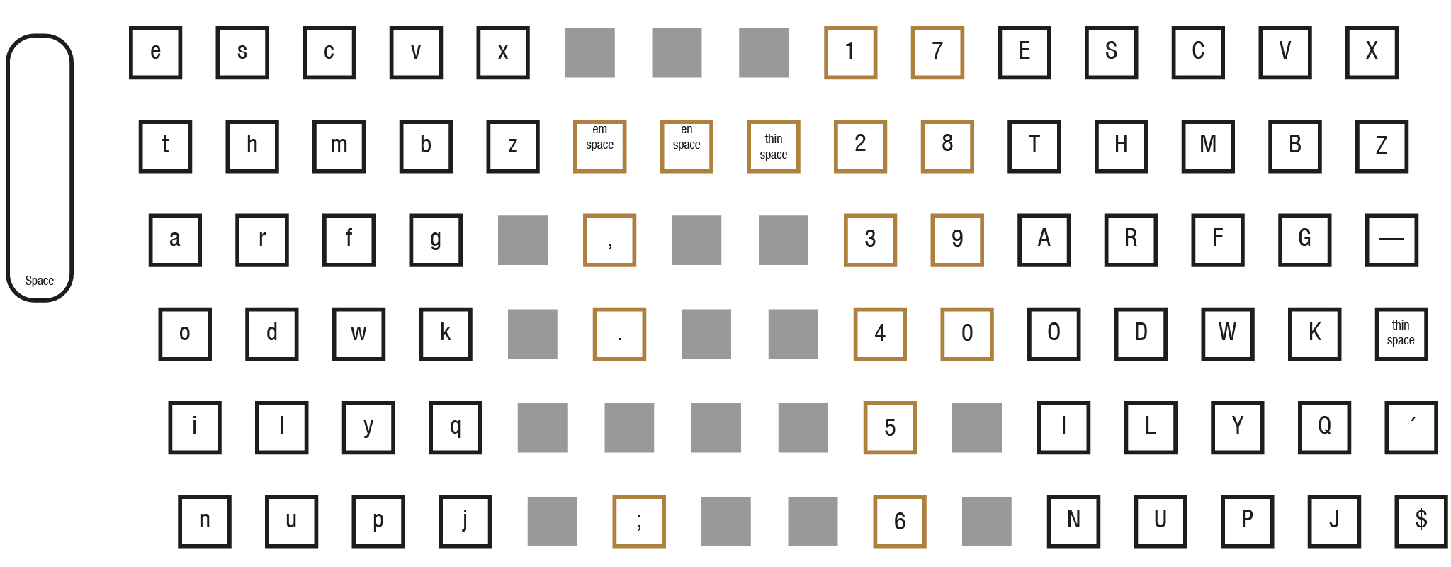
The description by the Mergenthaler Linotype Company is: (diagram nr. 149) Layout for two lower case fonts with spaces and points in 72-channel magazines, on 90-character keyboard. Caps and figures of each lower case font usually will run in two auxiliary magazines according to Diagram 52 or Diagram 177.
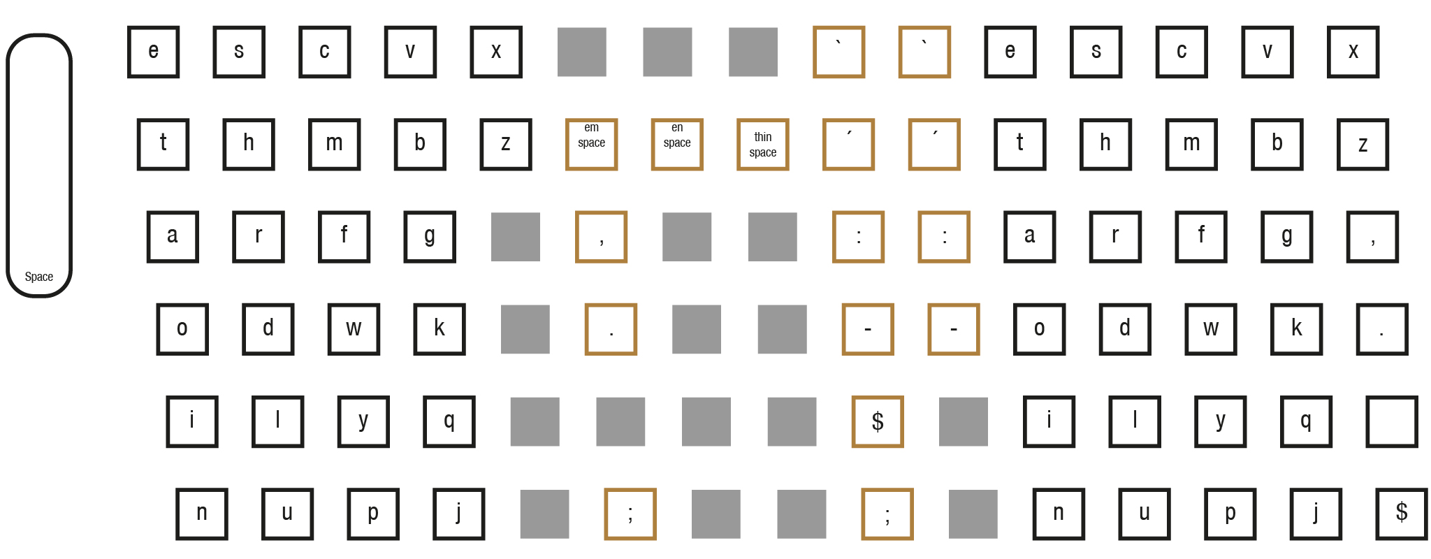
The description by the Mergenthaler Linotype Company is: (diagram nr. 52) Layout for caps and figures in 34-channel auxiliary magazine operated from main keyboard. Caps, figures, and spaces arranged in standard sequencefor easy keyboarding with caps Q, X, and Z running pi. Useful in conjunction with Diagram 135, where two lower case fonts run in main magazine; or with Diagram 52-a, for lower case of same font in second auxiliary of a Mixer Linotype.
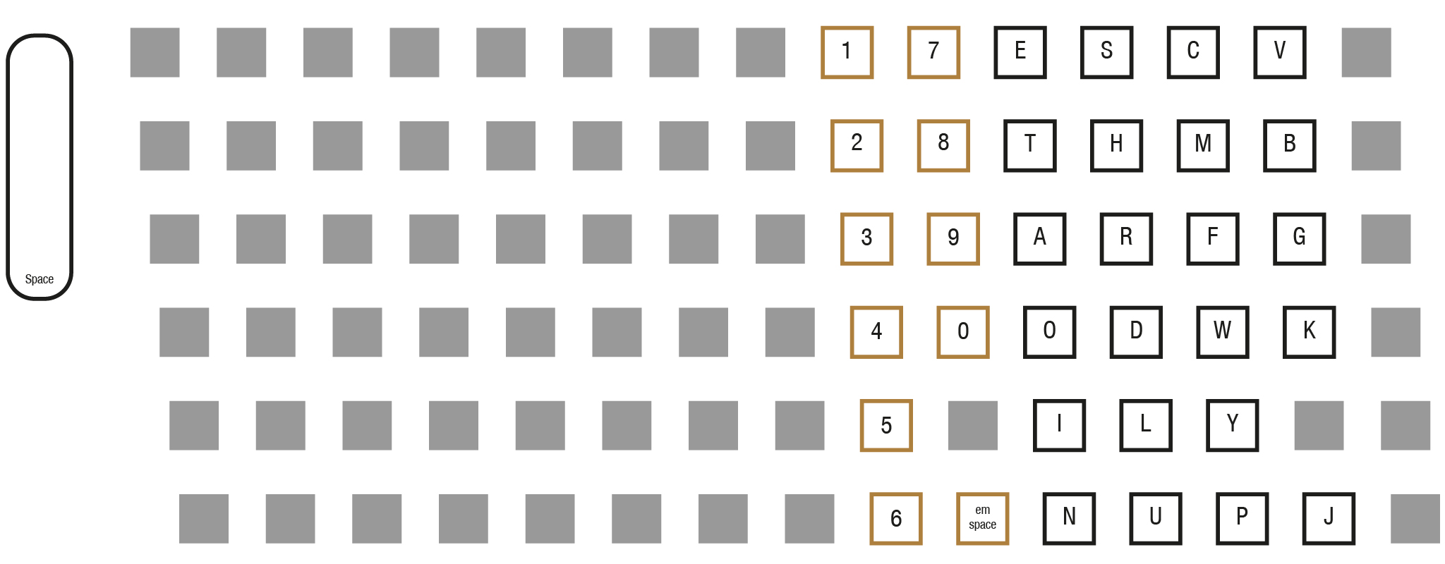
The description by the Mergenthaler Linotype Company is: (diagram nr. 52-a) Layout for lower case and points in 34-channel auxiliary magazine operated from main keyboard. Used on Mixer Linotypes.
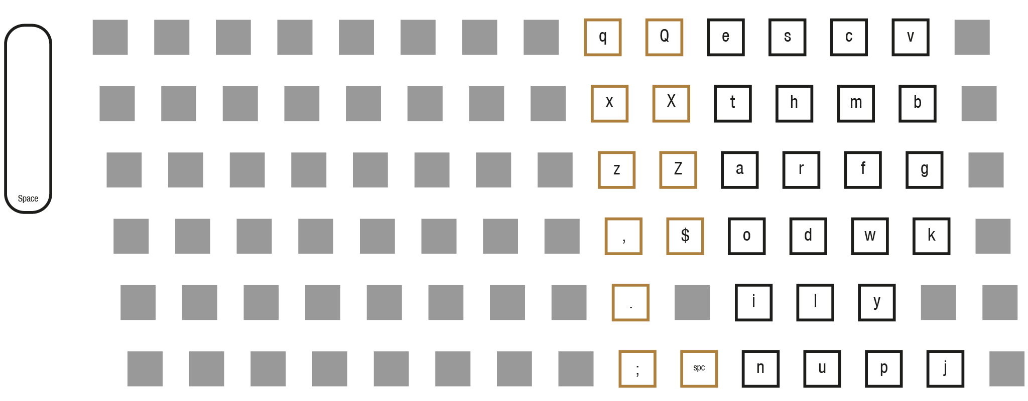
The description by the Mergenthaler Linotype Company is: (diagram nr. 51-a) The layout for two sets of advertising figures and points in 34-channel auxiliary magazine operated from main keyboard.
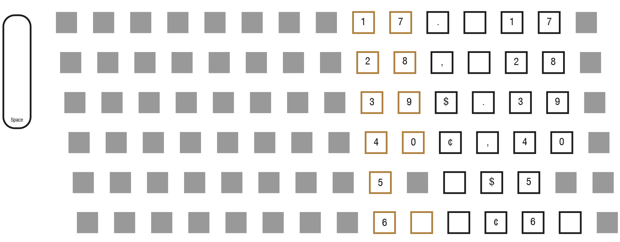
The description by the Mergenthaler Linotype Company is: (diagram nr. 177) Standard 34-channel auxiliary keyboard on double-keyboard machine. Layout arranged for caps, spaces, and figures, with caps Q, X, and Z running pi. Useful in conjunction with Diagram 135, where two lower case fonts are run in main magazine; or with Diagram 177-a, which will accomodate lower case characters of the same font in second auxiliary of a Mixer Linotype.
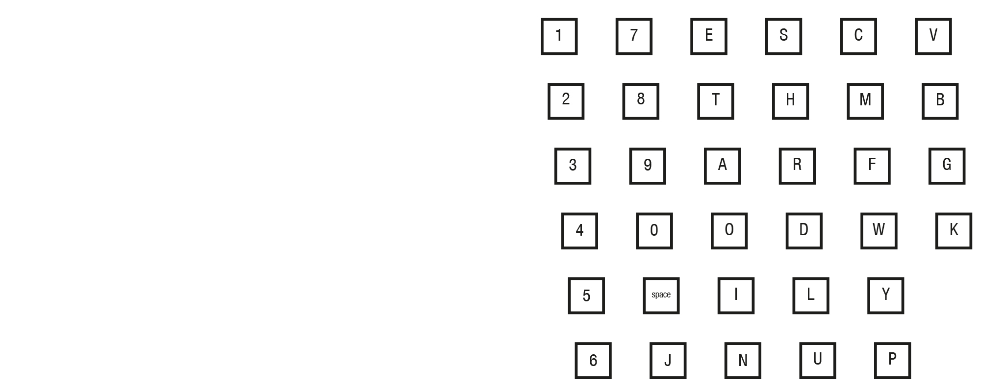
The description by the Mergenthaler Linotype Company is: (diagram nr. 177-a) Layout for lower case and points in 34-channel auxiliary magazine of double-keyboard machine. Used on Mixer Linotypes and useful when caps and figures of same face are run in another auxiliary magazine according to Diagram 177. When used in this manner the layout also accommodates the caps Q, X and Z which must otherwise run pi according to Diagram 177.
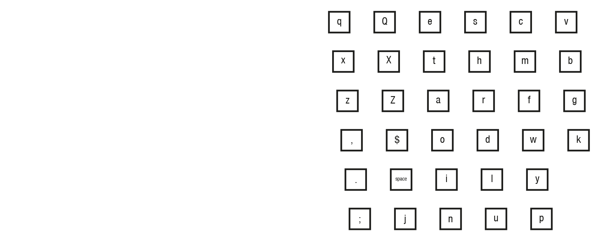
The description by the Mergenthaler Linotype Company is: (diagram nr. 177-b) Layout for two sets of advertising figures and points in 34-channel auxiliary magazine of double-keyboard machine. Will accomodate one set of advertising figures with a maximum matrix width of 0.315" running in left side, and one set of advertising figures with a maximum matrix width of 0.311" in right side.
C 2021-2024 Maarten Renckens and other contributors. All rights reserved. All materials on this website are available for non-commercial re-use, as long as the original author is mentioned and a correct reference to this site is added. Thanks!
All materials are considered copyrighted by the author(s) unless otherwise stated. Some materials from other sources are used. If you find materials on this page which you consider not free from copyright, a notification is appreciated.
All collaborations and additional sources are more than welcome. Please contact info@maartenrenckens.com if you have materials that you deem valuable.